
Stacker gives writers and designers a powerful way to communicate stories. A stack is embeddable anywhere, and it plays beautifully on mobile devices. The Stacker Editor is at the core of the platform and enables producers to arrange imagery and text, then publish their stack.
I led the design of the Stacker Editor in collaboration with a team of domain experts and developers to ideate, scope, explore, plan and validate the user experience.
The early version of the Stacker Editor was an in-house tool used by Newsbound to create and publish stacks for clients. Many of those stacks were hugely successful and generated a substantial amount of interest in the platform. Around the time that the in-house tool was readied for release to a handful of users, I joined Newsbound to work on the design of the Stack Analytics that users would see after publishing their stack.
The in-house Google Sheets-based tool was quite powerful, but it required users to learn a syntax, and it was not very forgiving when errors were made. It also assumed that the story would be fully planned ahead of time.
Over and over again, when I would interview users about the analytics dashboard I was designing, they would express their need for a user-friendly editor. We soon decided that our efforts would be better spent focusing on an easier-to-use Stack Editor.
While we were incredibly enthusiastic about all the things the new editor might do, we wanted to release working software as soon as possible. We worked together to arrive at a very distilled scope. Our process for this involved a master list that I displayed in the office of what was in and what was coming next, organized into logical feature categories. Once the scope was clear, I set to work designing the first version of the new editor.

As I turned sketches into pixel-perfect mockups, I did a few other things simultaneously. I delivered mockups to the team via Zeplin + Slack. I began to craft a clickable prototype intended for user testing sessions. And I began to recruit writers and designers to interview.

Regular feedback from the team helped to guarantee that most questions and concerns were addressed with thoughtful solutions well ahead of implementation.

User interviews were an essential part of the design process on Stacker. We used them to keep the experience of the new user in mind. We uncovered little stumbling blocks that we were able to fix, and we got the satisfaction of seeing improved experiences in subsequent tests. The tests gave us concrete feedback and an infusion of fresh ideas. As a team, we had a deeper understanding of our users’ needs.
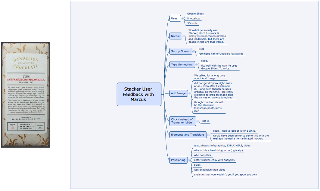
Every participant left the interview with a fancy chocolate bar and I left with lots of ideas.
I led the user testing effort by recruiting potential users, creating a shared list of questions to ask and things to learn, creating clickable prototypes, jumping through any hoops needed to test sections of our working software, taking notes and sharing the feedback with the team in a digestible format
In addition to providing the overall plan for the user experience and interface, I defined the visual language and delivered a set of vector-based elements.

For the benefit of the entire team, I created the demo data that we would use throughout the development and testing process. It was a pretty silly stack about kittens and space, but it covered every type of transition, delay, easing, build-up, panning and image type. Here is a screenshot showing that demo-data coming together:

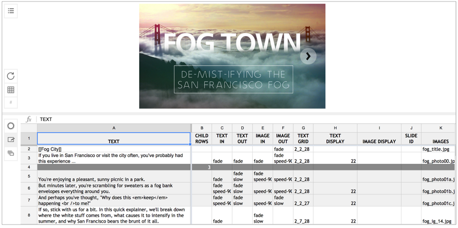
As our release neared, I recreated a Newsbound stack with the new editor. We chose the San Francisco Fog stack as the example to be included with every user’s new account. It shows off many of the things you can do with Stacker: click-by-click buildups, pans that stitch backdrops together, and placement of animated imagery, plus it tells an interesting story without too much text.
The recreation of the fog stack was also an essential litmus test for the app—the endeavor flushed out a bunch of remaining bugs that we were able to fix before launch. It also proved that the same level of polish that was possible with the in-house tool could be achieved, but this time in a much more user-friendly interface.

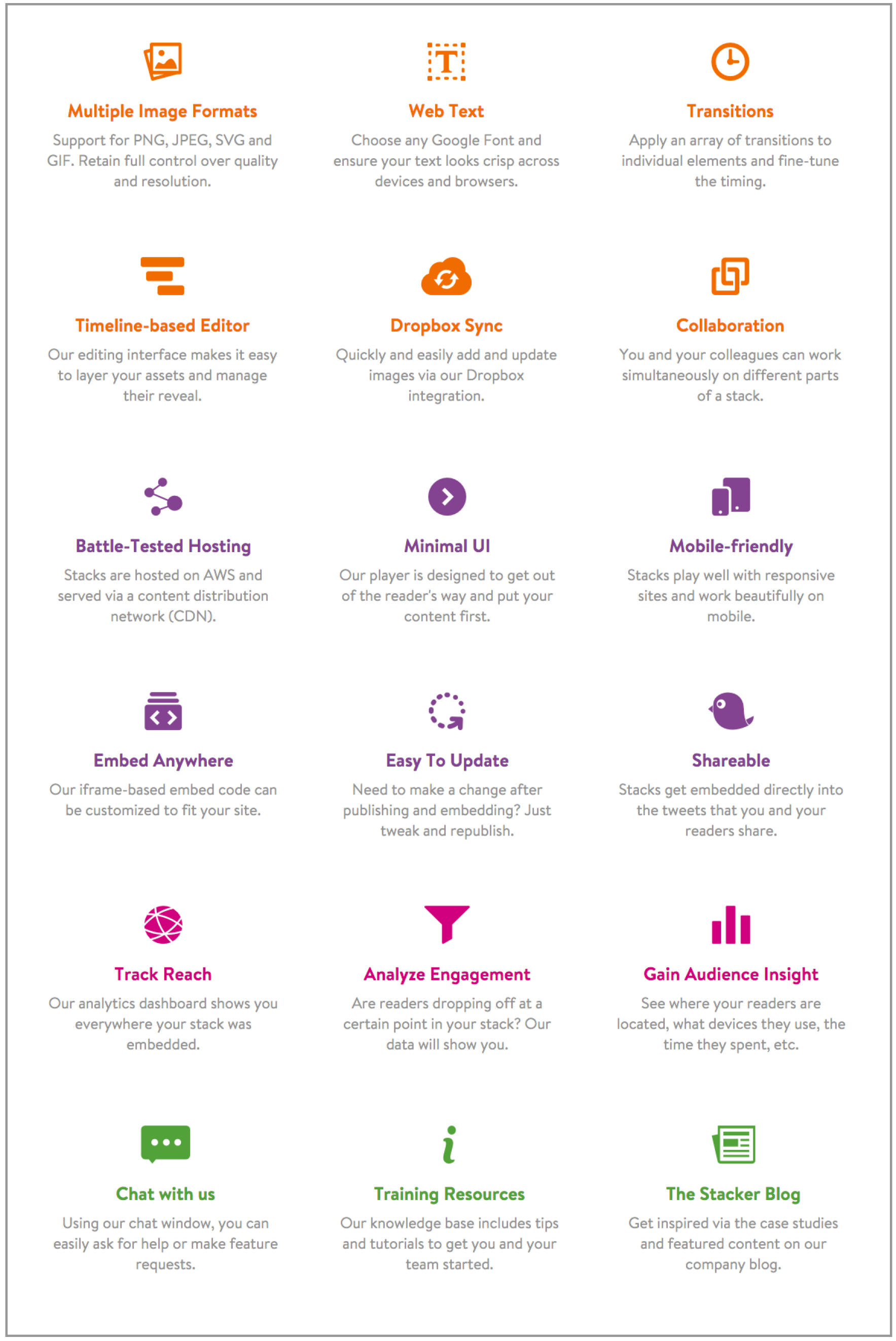
For our external communication, I collaborated with a front-end developer to fine tune the gallery and the sign-up links, and I illustrated this list of features for potential users to browse:
I enjoyed collaborating with a talented and focused team and I’m proud of what we were able to release in a relatively short amount of time. Here are some of the specific things that I contributed:

Stacker is free for personal use. If you’d like to create a stack with the new Stack Editor, please sign up at Stacker.cc.